
What are the 5 amazing UI Design tips?
There is no doubt that nowadays website designing is one of the best professions. Nowadays a website is not just a group of pages connected rather it is more than this. As there is a lot of progress in this field, so it is essential for you to learn the basic UI Design tips. A website is an interface where different things meet and communicate with each other.
You must keep in mind that this interaction creates an experience for the visitors and you should take care of the thing that this experience must be wonderful. It is the basic duty of the UI Designer, especially for a good web designer. The basic thing which can help in this process is to take care of the users. The following UI design tips will help you a lot.
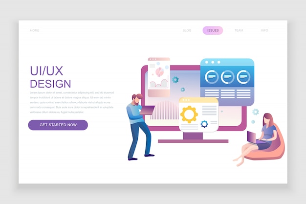
The basic difference between Interface design and user experience design is that UI design focuses on the layout of the functionality of interfaces and UX design focuses on the bigger picture. We can say that UX design deals with the bigger picture while UI design focuses on the part of the bigger picture. Let’s discuss the amazing tips.
1) Know Your Users for UI Design
In this tip you need to focus on the users and what are their needs. You should focus on those things which stand in their way of achieving their goals. This requires an excellent analysis of the stats. The basic thing of this tip is that you have to focus on the users, how they use your products and ask them such questions which go deeper than, “What do you think of this design?”
You should focus on the deeper things that what they want. By addressing the needs of the users, you will surely help them in achieving their goals. By analyzing the needs of the users, you will surely know from how they use the product to the needs of the users.
2) Define how people use your interface
It is an important thing that you should explain the way which will be helpful to the people in using the UI design. Because of increasing prevalence of touch-based devices, you must focus on this thing. There is a clear thing that people use the apps and websites in two ways: First, they interact directly and Secondly, they interact indirectly. Direct interaction includes an interaction with the interface elements of the product and Indirect interaction includes an interaction with UI design elements which are external to the product.
Examples of direct interactions for UI design
- Tapping a button
- Swiping a card
- Dragging and dropping an item with a fingertip
Examples of indirect interactions
- Pointing and clicking with a mouse
- Using key commands/shortcuts
- Typing into a form field
- Drawing on a Wacom tablet
The decisions depend on the users and what devices they use. If you are designing for seniors then you would not need to lean on swiping, but if you are designing for the writers then you would need to focus on the common keyboard shortcuts.
3. Set expectations

There is no doubt that many interactions with a site or app have consequences as well as anxiety. It is the duty of the UI designer that he/she should focus on letting the users know what will happen after they click. This can be done through design and copy.
Setting expectations with design
- There is a need to highlight the button that is related to the desired action
- You should focus on the understood symbol in combination with a copy
- A need to pick a color with a relevant meaning
Setting expectations with copy
- Need to write a clear button copy
- The designer should provide an encouraging copy in empty states
- Need to deliver warnings and asking for confirmation
4. Anticipate mistakes
There is no doubt that human commit mistakes but people should not have to suffer the consequences. There are two ways which can help the people to lessen the impact of human error:
- 1) There is a need to prevent mistakes before they happen
- 2) There should be ways to fix them after they happen
Most people can see a lot of mistake-prevention techniques in eCommerce and form design. All the buttons remain inactive until you fill out all fields. There is a Pop-ups option that asks you if you want to cancel your shopping cart or not.
There is no doubt that anticipating mistakes is often less frustrating than trying to fix them. You have to bear in mind that you have to let accidents happen. This happens when the detailed error messages come into their own.
When writing error messages, you need to make sure the two following things:
- 1) Explain the problem.
- 2) Explain how to fix it.
You can explain that the things deleted can be restored from the Trash and clicking restore. This principle, Anticipating user error, is called the Poka-Yoke principle. It is a japanese term which means to “mistake-proofing”.
5) Give feedback-fast

It is the principle of the world that whatever we do we have to receive feedback. But there is a fault in the UI design that it does not give feedback immediately. When it happens, then it leaves us wondering whether we have to reload the page, restart the laptop, or just switch to the nearest available window.
So loading animation is a necessary thing. There is a need to make the button pop and snap back when I tap it but not too much. There should be feedback. There is a need to make sure that it all happens very fast. Usability.gov defines the delay over 1 second as an interruption and over 10 seconds as a disruption.
The time of loading under 5 seconds makes the loading time seem longer. There is no need to display a progress bar instead there is a need to use a visualization that does not imply progress. There must be some visual tricks which help to make the load seem faster.