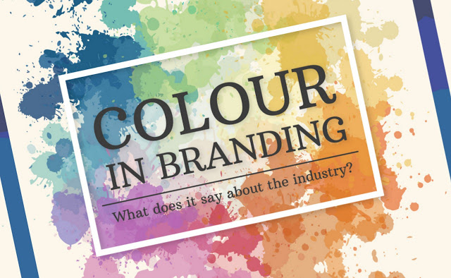

How to pick a good color scheme for your web design?
Choosing a good color scheme for your website could be a tricky job especially if you don’t believe in your color contrasting skills. It’s something that needs to be taken on a serious note. While the “SALES” part comes under the logical domain, color coordination makes its way to the emotional level. Good color combinations can exert lively influence on the visitors, enabling them to hold a worthy vision of the brand. If the color choices are not appealing enough, the visitor might give a cold shoulder to your website.
Colors have the quality of exercising the direct influence on the visitors within a flash. Although color combinations may seem a piece of cake at first, they have hard and fast rules. You can get your hands on amazing color combinations once you are done with the basic knowledge of the colors.
Color Scheme?????
Color scheme possess a characteristic quality of being meaningful. Each color comes up with a unique meaning-a meaning that stands different from the others. They are not confined within the boundaries of personal preference. Each color instills its magic in a particular way. They can convey an apt message about your business. That’s why they prove to be consequential for web designs.
“Color is a power which directly influences the soul.”-Wassily Kandinsky
Let’s peep into some meanings and emotions that accompany the colors!
Colors having a warm effect:
Some color schemes trigger warmth whenever you look at them. Their essence is naturally to give rise to extreme emotions. They can give energetic vibes to a visitor, but when they are used alone, they can boost up over-excited energies. Why use these warm colors all alone when you can mix them up with other neutral colors to balance their proportion. Maintain equilibrium between the portions of the warm color, so you can enjoy their stabilized warmth. The Following are some of the colors having a warm effect.
- RED– This color instigates passion, intensity, activeness, strength, and emotional excitement.
- ORANGE– This color excites the emotions of enthusiasm, perkiness, success, and determination.
- PINK-This color has a nature of softness, compassion, sweetness, and playfulness.
- YELLOW-This color gives fresh, optimistic, and lively vibes.

Colors having a cool effect:
Some colors instill a calm effect on the visitors. They are a TREAT TO WATCH. They are usually selected to spread wonders on websites. Their cool effect exerts a positive influence on the mind. WAIT! They have a downside if used excessively. If they continue to be overused, they can spread some impersonal touches to the website. The Following are some of the colors having a cool effect.
- PURPLE–This color is the true representative of glamour, ambition, spirituality, luxury, and power.
- GREEN–This color has been marked as the manifestation of freshness, calmness, trust, hope, relaxation, and healing.
- BLUE–This color incorporates the feeling of comfort, integrity, loyalty, calmness, and reliability.

Colors having a neutral effect:
These colors stand between the warm and cool colors and they have the characteristics of both. They act as good blended colors when mixed with warm or cool colors to balance the color tones on the websites. They tone down the colors appropriately. Want to keep the warm and cool colors at bay? You can grab these neutral colors to serve the purpose of your web design. The Following are some of the neutral colors.
- BROWN- This color marks the feelings of friendship, simplicity, credibility, and endurance.
- GREY–This color gives the touch of patience, wisdom, intelligence, and longevity.
- BLACK– This color highlights the effect of elegance, power, boldness, luxury, drama, and seriousness.
The Connection between colors and brand recognition:
Want to engage maximum visitors on your website? There is no other option than to choose good colors that can captivate the attention of the visitors. A good color instills desire, excitement, and loyalty among the visitors. They make the visitors glued to your website. Once the basic step of color selection is done, the users will highlight a good brand among the jampacks even without giving an eye to the logo.
Although different colors stand for different meanings as mentioned-above, yet brands play up with certain colors to create trends-TRENDS that can pave the way for brand recognition. For example,
- RED & ORANGE are used to denote the restaurants.
- WHITE, BLUE & GREEN are used to denote the hotels.
- BLUE for banks.
- BLACK for luxury products.
Some of the well-known brands that have a characteristic color combination include McDonald’s for the super amazing red and yellow combination, Dior for black and white color, and Discovery’s raisin black and bright navy blue.
“Color! What a deep and mysterious language, the language of dreams.”-Paul Gauguin.
Don’t fret if you are stuck between the tons of color combinations. Choosing a good color that signals the QUALITY of your brand is a tough job. You can take ideas from the color combinations of iconic brands. You can also try to form unique color combinations by understanding the color meanings.
Perks of Color theory + web design:
Once you are done with the basic knowledge of color combinations, you can mold them intentionally to enhance the traffic on your website. You can control your user’s behavior through the medium of color theory.
Color theory is the logical pattern behind the intermingling of colors on the color wheel, that works well enough in web design. There are numerous approaches to color schemes but the most widely accepted among them are:
- Complementary
- Triadic
- Analogue
You can deviate from the traditional color scheme by residing in the advanced selections on the color wheel. Try to take up the complementation, contrast, and vibrancy approaches.
- Complementation: It is the approach of developing suitable interaction among the colors. You pick up the colors from the opposite ends of the colors wheel and try to match them suitably. Once they are matched, they give a soothing effect to the eyes. The reason is that the colors merge well in a balanced proportion.
- Contrast: It allows you to make apt sections on the page, giving a good highlight to the readability of text. By opting for the contrastive approach, you can attract your visitor’s attention. The visitor is likely to direct his attention to the highlighted specific portions of the page.
- Vibrancy: Nothing is more important than focusing on the vibrancy to control the emotional preference of the visitors. Whether you go for brighter or darker shades, you will witness different results for each case. Brighter choices yield energy and the darker ones keep you on a relaxed track. Each of them enables you to pay much attention to the content.
The following are some of the ideas that will help you select a good color scheme for your web design.
1. Choosing the basic color:
Do you want to play with your web design colors? Your foremost concern should be to select a basic color for your brand. Consider the elements that make up your brands such as logo and other brand materials. Match up the color with the logo design-a color that complements the logo!
If you don’t find yourself in the secure section of choosing basic colors for your brand, you can wield color psychology and a color wheel to develop a suitable association.
2. Spreading shades:
Once you are done with choosing the basic color scheme for your website, you can direct your attention to the color scheme. It can be a tiresome job to select an appealing shade for your website. Some websites work with only one color, but most of the time you will feel to spread marvels using different shades and tints.

Incorporating the primary color sceme throughout the whole web design can prove highly mundane. You can make subtle changes to the basic color by toning it down or brightening the tint. This will unravel many radiant aspects of web design. For example, if you go for the lighter shades of one color sceme for the advertisements’ section of the website, then you can wield the darker shades of the same color scheme for the texts to make it appear more highlighted than the others.
Want to know the best tool for color selection? It’s the Adobe Color Wheel. This tool offers no tough rules for color selection. It is super simple to use and you can explore wondrous color schemes through it. Select a primary color through this tool and then add modifications to it to achieve the desired shades of the same color. Give a try to this amazing tool!
3. The 60-30-10 rule-A balanced rule of three:
This rule is any web design fan’s best friend! It is a super simple and balanced rule. According to this rule,
- 60% of any design should be comprised of the dominant color.
- 30% should be comprised of secondary colors.
- 10% should be comprised of accent colors.

This technique creates harmony among the colors in their suitable amalgamation. This is a balanced proportion that adds fine aesthetic touches to the web design. The harmonized design leads to a color combo that is visually attractive to the eyes.
4. Contrastive technique:
If you want to highlight certain important aspects of your website, then you can opt for the color contrastive technique. It is a consequential aspect of visual composition. For example, if you want to direct visitor’s attention to a certain area of your website then you can play with contrasting colors such as black and green or red and blue etc.
Color contrasting is a helpful technique but it needs to be handled carefully. If you always choose sharp contrasting color schemes all the time, it will be troublesome to focus on the written texts of the website. Maintain an equilibrium by choosing the mid-level contrast for your web designs. Use high contrast only when there is a dire need for highlighting texts.
5. Playing with images:

Images can be helpful while defining a color scheme for your web design. If you have any idea about an image that stands perfectly for your brand, you can extract the essential color schemes from there. No doubt, playing with various images can be difficult as you have to maintain an equilibrium between the color proportions. There are numerous ways of developing a balance among your images such as:
- Wield neutral color scheme to stabilize the effect of images.
- Modify the vibrancy to curtail the tone of images.
- Calibrate the images by shifting them into greyscale.
You can check out the possible solution that works well for your web design. Then go for the images that share proximity to the color scheme.
Colors-a revitalizing force for web design!
Color scheme plays an overriding part in web design. The color scheme theory stands among the plenty of tools that you can utilize to create a wondrous web design. Colors are spread everywhere in our life. It depends on us how we choose the right colors and fit them into yielding desired emotions.
The design doesn’t come with strict rules. It allows a flexible platform that enables you to deviate from the rules and exert your complete design autonomy. Trust your intellectual and creative instincts and go for some amazing color schemes for your web design.
“Great Design is advantageous and adventurous.”-M.Cobanli