Color Psychology: How to Choose Best Color for 2021 Logo Designing and Branding
Introduction: Decoding Color Psychology
Colors are the most important part of human life. From childhood humans loved colors. Different colors represent different emotions and nature. They play a vital role in influencing human thinking, the elevation of mood, and human reactions, thus making their way to human psychology. These colors hold tons of meanings inside them which not only portray different cultures but also fascinate human eyes.
Brands and logo designers use this color psychology of humans to attract their products. They play with the colors alongside other graphic elements and integrate them in such a way that not only conveys the meaning of what they are selling but also explains the nature and properties of the service they are providing i.e friendliness, trustfulness, freedom, and motivation, etc.
Any designer or brand holder must consider the following guide of colors in order to attract their buyers:
What red color defines in designing logo and in branding:
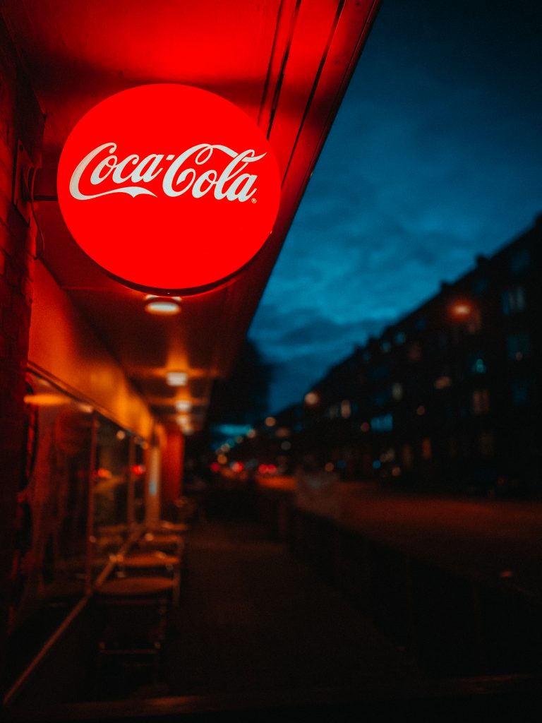
Red is considered as one of the warmest and intense colors. It defines human passion, energy, love, desire, importance and excitement. Red is the blood color of humans that highlights many emotions and activities in the body like increasing metabolism etc. You can see the reason why everywhere on the websites across the world highlight the “Click here” button as red; because of its radiating warm energy to attract viewers. But it is recommended that don’t overuse it; it can cause distraction. Maroon, Coral, Cabernet and burnt orange are some catchy shades of red. Brands that used red in their logo design are Pinterest, Virgin, target, Coca Cola, KFC, Kellogg’s, Canon
What yellow color defines in logo designing and branding:
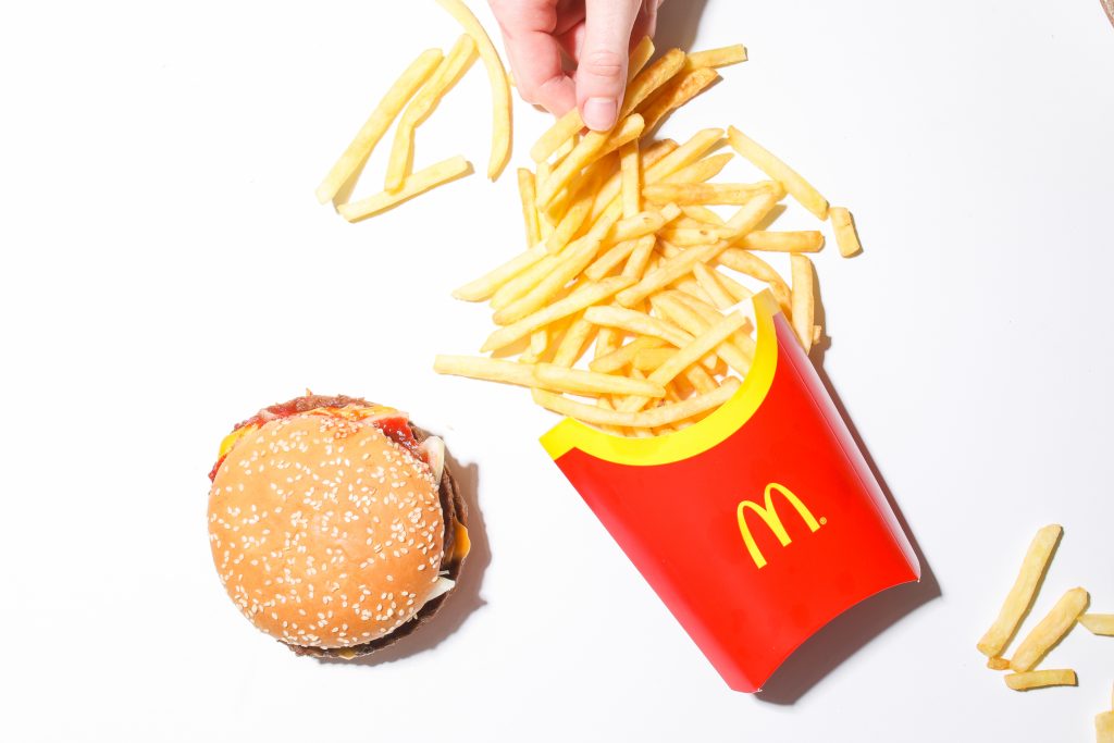
Yellow color is often defined as the vibrant colors. It is associated with cheerfulness, motivation, optimism, positivity and friendliness. It is always recommended to use whatever color in a balanced quantity so it’s effect doesn’t get faded. Little amount of yellow can cause feelings of low self-esteem, anger, fear and isolation. Some shades of yellow which can be used instead of pure yellow are honey, mustard, gold, lemon and banana. Famous brands or Channels used yellow perfectly are McDonald’s, Snapchat, Nikon, imbd, National geography.
Psychology of Blue color in branding and logo designs:
The blue color inspires us to trust, gives us strength, accentuate loyalty, radiate mystery and above all it’s the color of nature; color of sky and the ocean. The use of this color in an adequate amount can bring dynamic effect to the products of your brand and in the design of your logo but it’s excess usage can cause a sense of self-centeredness and negativity in the eyes of the viewer. Teal, Azure, Dusk, Royal and denim are some shades of blue which can be incorporated in logos. Some of the best blue logo designs are of twitter, Facebook, Oral B, NASA, Walmart and Vimeo.
Effects and Color Psychology of Green in logos and branding:
Welcoming green in your designs can bring a sense of health, harmony and growth. It is associated with the beginning of life and productivity. Green is the color which is used by nature itself the most. It brings the feeling of tranquility and refreshment. It sometimes belongs indirectly to money and continuous effort and struggle. So any logo designer and brand can select this color as a background of his logo and brand. Forest, Mint, Emerald, Chartreuse and lime are some variants of green color that can be used in logo designing. Spotify, Heineken, land rover, John Deere, and Starbucks are some famous brands who select green as the baseline color of their logo designs.

Best Graphic Designer in Islamabad
Best graphic designers that will make your brand AWESOME. Available 24/7/365 to give your business a boost.
Meaning of purple color in branding:
Some variants of purple color are lavender, eggplant, orchid, violet, and plum. Picking this color and it’s any variant is an ideal way to bring a sensation of creativity, wisdom, trustfulness, and authenticity. Color Psychology of purple often defined it as the symbol of spirituality. Though Purple color is a combination of blue and red therefore it holds their qualities. Adding this color in your logos and branding highlights the adjectives of glam, elegance and luxury. Milka, twitch, Yahoo, BenQ, Cadbury and Taco Bell are the perfect example of incorporating this color.
Psychology and usage of Black in designing Brand’s logos:
Decision of incorporating black color in the designing brings a sense of sophistication, elegance, power, protection and domination. It represents spirituality and mystery. It is also sometimes associated with death. If you want to bring an element of power in describing your logo and brand, then this is yours go to color. Charcoal, pewter, silver and concrete are some shades of black which can be added alongside black. Perfect additions of black are Nike, Channel, Zara CNN, WWF and Disney.
Meaning of Brown color in logo designing and branding:
Add a brown color palette i.e umber, cinnamon, pecan, mushroom and ginger into your logo and brand designing in order to bring sensibility, trust, reliability and unity. It is the color of soil and thus also has qualities of nature. This can be yours go to color with it’s different shades.
Color Psychology of white in branding:
White color defines itself for simplicity, lightness, innocence and guidance. Incorporating this color in your logos can’t go wrong. This will give your design a simple and cleaner look without any ambiguity.
Meaning of Orange color in logo designing and branding:

This is the color of everyone’s favorite fruits i.e Orange. It highlights the qualities of joy and excitement, confidence, freedom, motivation, and sometimes associated with autumn. It is used by digital and creative agencies in their branding. Color Psychology says that it shows the enthusiasm, excitement, and freshness of the teams. It also boosts the feelings of hunger in your brain, that’s the reason why restaurants use this color on their walls as a theme and many beverage brands in their logos. SoundCloud, Harley Davidson, Amazon, Nickelodeon, and The Home Depot are some mind-blowing brands that choose orange in their logos.
Color Psychology of Grey in designing and branding:
Grey is something which can never go wrong with logo designing and branding. It has adjectives of efficiency, practicality, mystery and balance. It’s often described as a symbol of class. That’s the reason why Apple, Nissan, Wikipedia and Toyota chose grey.
So in the light of the above discussion, one must consider the properties of colors while selecting them in designing. Different colors have different meanings in different cultures. And from region to region their hues and shades also vary their meanings. So color psychology says that; have this color guide to enhance your knowledge of color palette for designing your logos and branding to standout in the market. Head to the linked article to get deeper insight.